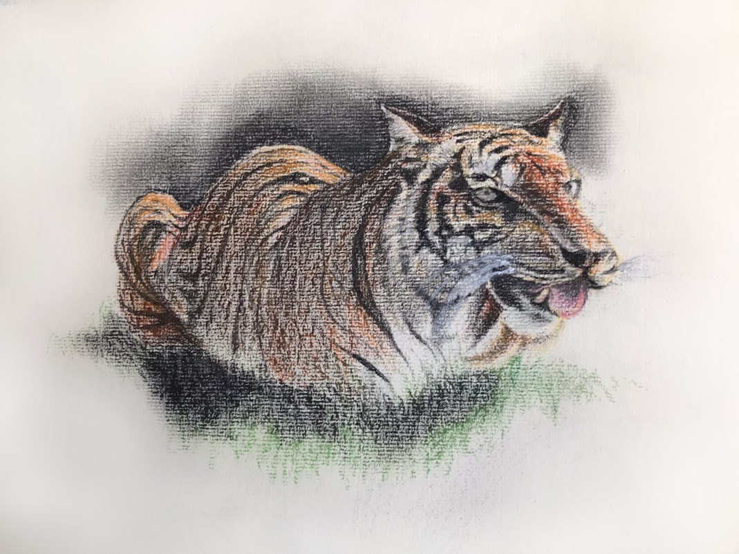
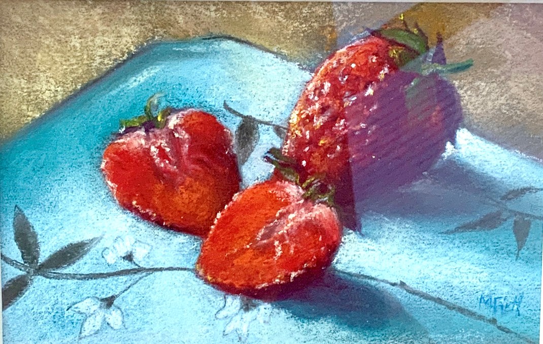
Whiskers! How the hell do you draw/paint in pastels?

Welcome to the forum.

Here you can discuss all things art with like-minded artists, join regular painting challenges, ask questions, buy and sell art materials and much more.

Make sure you sign in or register to join the discussions.

Hang on Studio Wall
Showing page 2 of 2
Message
I clicked on the link ( as I said) and it was fine, not suspicious at all. Look forward to seeing your animal pics Roger.
Good to hear back from you Roger, go for it and let us see the final piece!
Another thought re Whiskers.   White gouache ?
Some pastel artworks for you to judge. You will see the difficulty with whiskers on the cats. I think a smoother surface might be more suitable rather than the highly textured pastel paper I have used. Also sometimes the reverse side of the medium seems to work better. Always very enjoyable though.
I can see your problem….Texture of the paper. The smaller your image, the smoother the surface must be. This applies to small oils too but a coat or two of gesso helps with those, or a fine surface. If you’re wanting the texture of the paper to add to the effect ( rough seas, rocky shores etc ) then that works. If you’re going for a finer result then the paper/ support matters. I always use the reverse side of Canson Mi- Teintes ( unless I forget!) because I want a smoother finish. Canson “Touch” is excellent because it’s rough and holds the pastel yet has a smoother finish See below:-  However, important that is though ( the surface), it doesn’t seem as though you have blended the base colours, keeping them thin, then worked on top. If you’re using pencils there won’t be too thick a layer but if you’re using pastel sticks, especially soft pastels on the last layer , it will make a difference. Your last image works very well with the texture showing. I like that one very much. I like the others too but perhaps if you blend the background with your finger it will help the image to stand out more. My pastel work has changed over the years. I started off using pencils and cheaper pastels, the results were more like drawings. Now I like to use pastels thickly, more like a painting and I like the vibrancy of soft pastels. But we are all different in what we’re aiming for…..it’s not plain sailing this art business!

Edited
by Marjorie Firth

Roger, I was looking again at some of my pastels….this one is almost the reverse of white showing up on black. I added the pattern to the plate by rubbing thick pastel well into the paper and then the thin marks ,pencil, were “ accepted”. The highlights went on last. Don’t be afraid to add lots of pastel, just blend it well and tap off the excess before you add the “ top coat” ( the whiskers).

Edited
by Marjorie Firth

Superb examples of your pastel work Roger , Marjorie has offered some very sound advice , she certainly knows how to use pastel something I find difficult.
I like the tiger composition, very much. Not a great user of pastels, I've tried them about twice, but Marjorie is definitely an expert, great work.  I wonder if, like watercolour, it's the quality of the pastel ie the density of the pigment that makes the difference?

Edited
by Norrette Moore

It certainly makes a difference with vibrancy and coverage - just like any good paint, the better quality  the purer pigment…you need less in a way.
Showing page 2 of 2